

Now, we like to think of ourselves as logical beings, but we will in fact, make purchases based on emotion and then we rationalise our purchase with logic. Colour triggers these emotional responses, which means, your business brand colours, your product colours has a real impact on your customer’s buying decision.
Do you know what effect your brand colours – the tone and the colour combination – are having on your potential customers? Are they attracting or repelling your ideal clients and customers?
Colour is registered by the brain before images or typography, making the colours you use for your business branding a key component of your brand’s identity and personality. So, why wouldn’t you want to get your colours right?
There are significant tests to see why some brand colours are integral to the emotion they elicit from clients. Colour plays an important role in our lives. It can influence our thinking and have an impact on our actions as well as reactions. We can become irritated or calmed. It can raise our blood pressure or suppress our appetite.
The colors you choose to incorporate in your branding (also known as your brand color palette) play a huge role in how your brand will be received by your audience, which ultimately will play a huge role in how successful your brand is with said audience.
How important is it? Well, a recent study found that up to 90% of initial judgments about a brand or product are made based on color alone.
So, in other words, it’s pretty darn important.
But why are the colors you choose so important? What kind of influence will they have on your audience? And how do you choose the right colors for your brand?
So, the first step in understanding why the colors you choose are so important to your branding is understanding the way colors influence people.
Different colors have different effects on people. In fact, there’s an entire science dedicated to understanding how colors affect people; it’s called color psychology. And according to the principles of color psychology, the colors you choose to include in your branding can have a serious influence on your audience and how they perceive and interact with your brand.
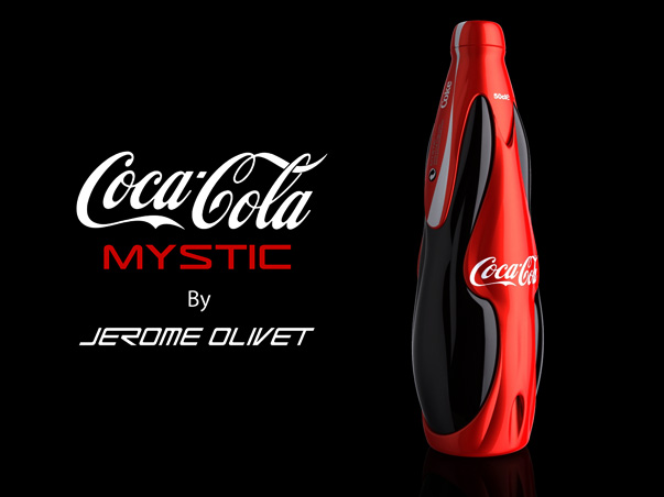
Colors can affect how people feel, how they behave, and how they perceive things. So, for example, let’s take the color red. Red is widely perceived as an aggressive color and is often used to signify danger or passion. From a branding perspective, it’s often used to excite the audience.

If you were launching an action sports beverage, red would be a great color to use; it would provoke the high energy, thrill-seeking feelings in your audience they’d need in order to buy your product.
But if you were launching a line of relaxation supplements, red would be a less than ideal choice; because red tends to ignite excitement in the audience, it’s out of line with your overall branding of being focused on rest and relaxation.
Instead, use pastels color, cool-toned colors or earth-toned colors for relaxing and soothing feelings.
The Emotions of colours:
Like I mentioned earlier in the article, different colors have different effects on different people. There’s no hard and steady rules on how color will influence an audience; people bring their own unique perspective to how they interact with your brand, and their past experiences will color the way they view and react to the brand color palette you choose (pun intended!).
That being said, the majority of people do have similar reactions to certain colors, and using these as a benchmark can help you understand how to use color to your advantage in your branding.
Here are some ways colors are perceived in branding:
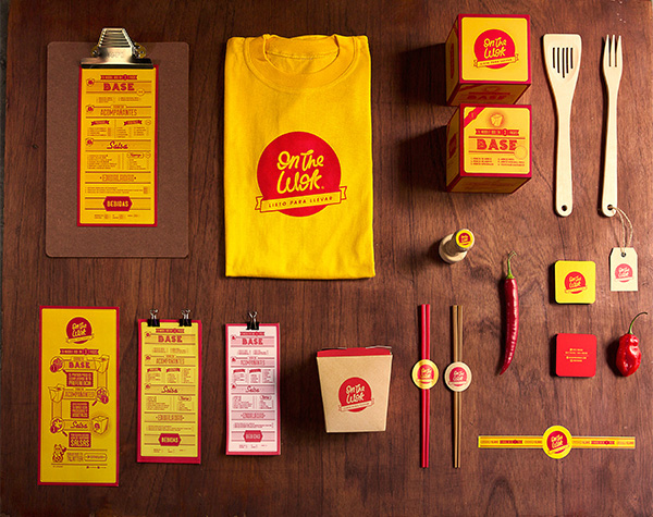
Red
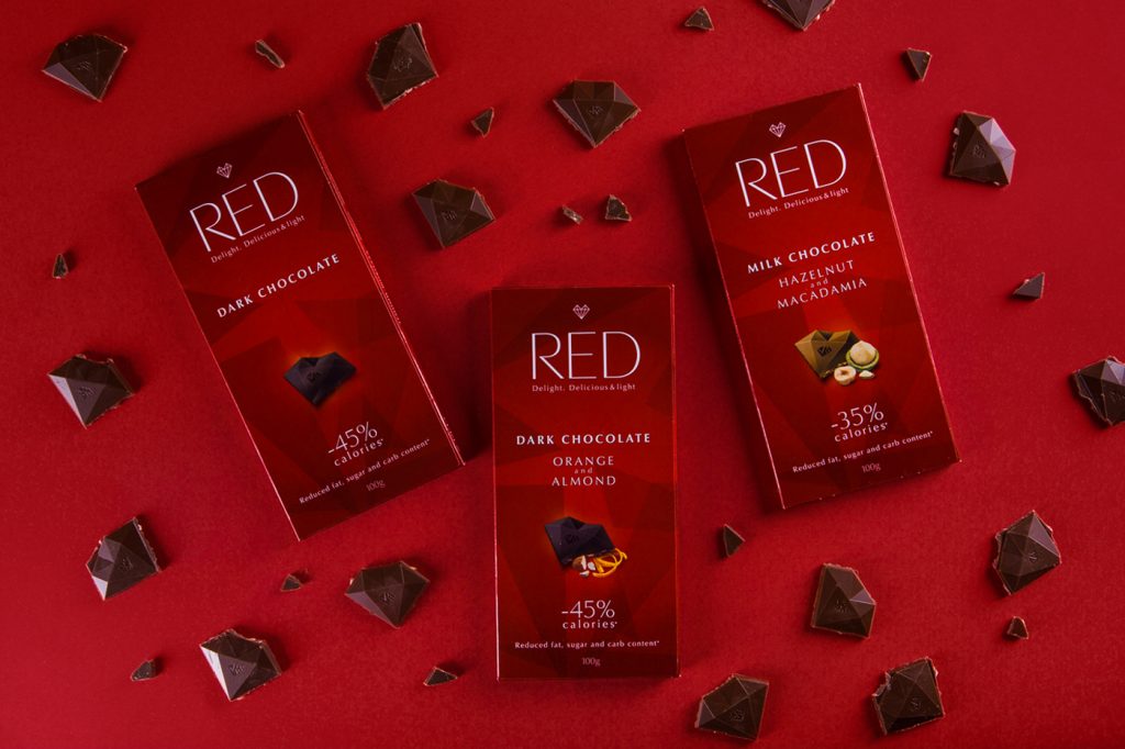
Feelings Associated With Red: Passion, Love, Danger, Excitement
Ways It’s Used In Branding: Brands often use the color red to generate a sense of excitement or urgency within their audience.
Orange
Feelings Associated With Orange: Happiness, Optimism
Ways It’s Used In Branding: Brands use the color orange to appear warm, approachable, and friendly. Orange is also a common color choice for brands targeting children.
Yellow
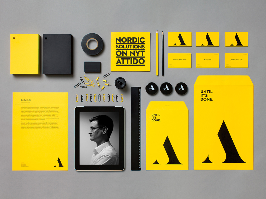
Feelings Associated With Yellow: Happiness, Optimism (also sometimes associated with Instability or Craziness)
Ways It’s Used In Branding: Similar to orange, yellow is often used in branding as a way to appear warm and approachable.
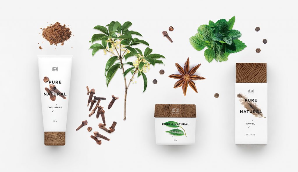
Green

Feelings Associated With Green: Calm, Serenity
Ways It’s Used In Branding: Because it’s so prominent in nature, the color green has an instant calming and soothing effect on consumers. Companies typically use green as a way to signify their ties to nature and health.
Blue
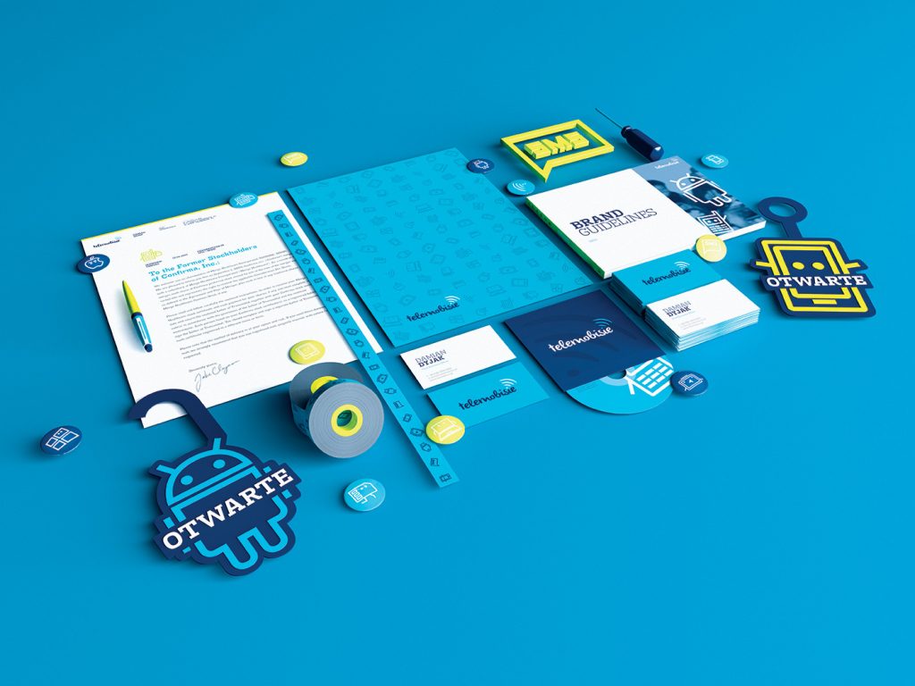
Feelings Associated With Blue: Calm, Serenity, Confidence
Ways It’s Used In Branding: Similar to green, blue is a natural color that instills a sense of calm. It also is associated with stability and can increase consumer trust and confidence
How To Choose The Right Brand Color Palette
Now that you have an idea of how color will influence your audience, it’s time to choose your brand color palette.
When choosing your brand color palette, you want to begin with your audience in mind. Who are your target customers? What is the effect you want your branding to have on them? And, based on those two factors, what are the best color choices to get you there?
Different audiences are going to require different color choices. So, for example, if you were launching an outdoor gear brand targeted towards middle-aged men, the colors that would have the most successful effect would be completely different than if you were launching a toddler clothing line for girls ages 2 to 5.
Think about who you are as a brand, who your audience is, and what color best bridges the two together.
If your product is gender specific, then you will want to take the colour option a step further.
Briefly, by percentage, women’s favorite colours are blue by 34 percent, purple with 23 percent, followed by green by 14 percent and red by 9 percent. The least favorite colour is white, at 1 percent.
Men’s favorite colours break down by the biggest percentage was blue at 57 percent, followed by green at 14 percent, black at 9 percent and red at 7 percent. Least favorite on this chart is yellow at 1 percent.
In terms of colour perception and preferences, results showed that women prefer soft colours while men prefer bright colours.
A study by Attention, Perception, & Psychophysics Aesthetic Response to Colour Combinations: Preference, harmony and similarity, reveal that colour evokes the mood and feeling that your brand creates in the buyer. This plays a major role in persuasion.
As you design a marketing plan and are considering colour, note that the colours you chose will be important to elicit the response you are looking for. You want to show a clear message for your business.
The colors you choose to include in your brand color palette say a lot about who you are as a brand, and they also determine how your audience will ultimately perceive and interact with your brand. Make sure you choose the colors that both feel true to who you are as a brand and are the most likely to get you to your desired results.
Ping us back for such a wonderful selection of colour palettes that fits your business.